
Image Reference - https://www.pexels.com/photo/people-discuss-about-graphs-and-rates-3184292/
Generally, insightful visualizations express the hidden meaning within a given set of data. Data collected as healthcare indicators are no exception to this generalization. In this blogpost, an attempt is made to illustrate following two healthcare indicators by plotting in cartesian co-ordinates: -
Institutional Delivery – Institutional Delivery be expressed as “Percentage of Institutional Deliveries with respect to estimated total Deliveries”
Delivery Points – Delivery Points be expressed as “Percentage of Delivery Points with respect to estimated requirements of Delivery Points”
Now, these indicators should include data from both public and private healthcare services. However, mostly, it is observed that such data are available only for public sector healthcare services. So for now, let us modify the above indicators to indicate public sector healthcare service provisioning. So, the above indicators may be considered as: -
Institutional Delivery in Public Delivery Points in Percent (ID@PDP) – Institutional Delivery be expressed as “Percentage of Institutional Deliveries in Public Facilities with respect to Estimated Total Deliveries in Public Sector Facilities”
Public Delivery Points in Percent (PDP) – Delivery Points be expressed as “Percentage of Public Delivery Points Available with respect to estimated requirements of Public Delivery Points”
But, both the indicators could be collated for different hierarchies of geography within a state. Commonly used hierarchy of geography for a federal states in India (going smaller geography to larger geography) are as under: -
Village
Revenue Village
Block
Tehsil
District
Division
State
Going with the administrative design, a block can be considered as the smallest geographical unit of governance for implementation of schemes or for understanding healthcare indicators. Keeping this in view we will consider that the above mentioned indicators are organized at block level. Thus, the indicators may be modified as: -
Block Wise Institutional Delivery in Public Delivery Points in Percent (ID@PDP)
Block Wise Public Delivery Points in Percent (PDP)
Keeping in mind the above discussions, let us attempt to plot the above indicators in cartesian co-ordinates.
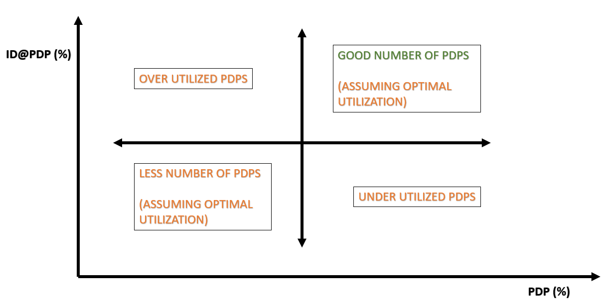
Figure – 1: Institutional Deliveries in Public Facilities versus Available Public Delivery Point
It is evident from Figure – 1 that block wise utilization of public delivery facilities can be observed based on data visualization of the above mentioned two indicators. Assuming optimal utilization, the block with high PDP(%) and high ID@PDP(%) could be considered that nearly good number of PDPs are available to accommodate Institutional Deliveries taking place in the block under consideration. Similarly, assuming optimal utilization, the block with low PDP(%) and low ID@PDP(%) could be considered as having inadequate numbers of PDPs (Public Delivery points) to accommodate Institutional Deliveries taking place in any block falling in this region of cartesian co-ordinates as plotted above. A low PDP(%) and high ID@PDP(%) may mean that the PDPs are stretching beyond the capacity to accommodate Institutional Deliveries taking place in any block. And a high PDP(%) and low ID@PDP(%) may mean that the PDPs are remaining under utilized despite catering to Institutional Deliveries taking place in any block.
However, while doing the above analysis (as depicted in Figure -1), the assumptions are as under: -
For every block, an estimate for (Total) Deliveries (usually based on demographic data and fertility rate) is accurate.
Only a percent of estimated (Total) Deliveries as above may avail the services of Public Sector facilities. This percent is assumed to be chosen correctly. And, thus, the estimated total Delivery in Public Delivery Points is reasonably close to real value.
Non-Institutional deliveries are suitably factored.
All Institutional Deliveries taking place in Public Sector facilities are recorded accurately.
PDPs are largely similar with nearly the same size and capacity as average taken into account for every block.

Figure – 2: An Imaginary Example for comparing Institutional Deliveries in Public Facilities versus Available Public Delivery Point for blocks of two divisions
In Figure-2, an illustration of two imaginary divisions having contrasting PDPs is shown. This is just to explain the point made above through an example, which may not be very unlikely to find in real data pertaining to two different divisions located within one (or different) federal state of India.
/**********************************/
No comments:
Post a Comment